wātea – Corporate Design
The New Zealand outdoor clothing brand wātea wanted a striking design
that reflects their company culture and makes them stand out in the market.
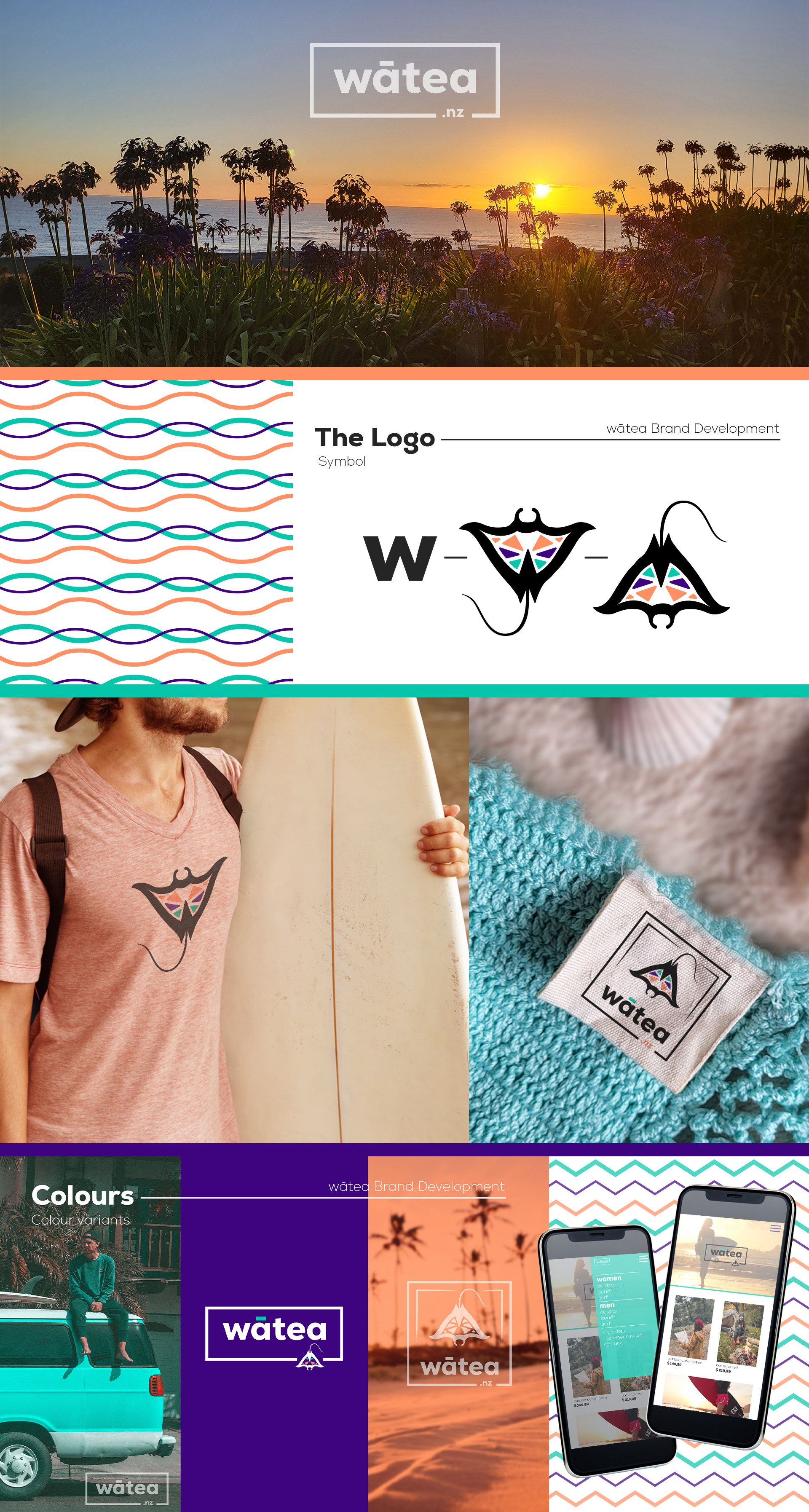
Their philosophy revolves around freedom and speaks to campers, surfers, and travelers. Since they deeply value their cultural identity, I explored the Maori culture in depth.
In Māori, watea means “free and pure.” In their tradition, the stingray symbolizes freedom. I combined these elements into a wordmark and symbol-based logo. The colors are modern yet bold, ensuring the brand stands out. The logo was developed in three variations for optimal adaptability, including a symbol-only version for labels and packaging.
Additionally, I created the first UI design for the brand’s app and online store.

Anna Papakonstantinou, Communicationsdesign in Hamburg.
Graphic Design, Animation, Illustration.
mail@anna-papakon.com • +49 152 5357 1361